

Top Outdoor Wall Tiles That Instantly Elevate Your Exterior Style
2026-11-19
Most exterior makeovers miss one surface—the wall. A fresh coat of paint fades, but top outdoor wall tiles that instantly elevate your exterior style change the way light, shadow, and texture move across your home. They turn a plain facade into a deliberate first impression. At Beata Ceramics, we see this shift every day: the moment a homeowner stops choosing safe and starts choosing surfaces with character. This guide walks through the looks worth knowing before you commit.
Texture That Reads Well From the Street
The facade doesn't whisper; it carries a grain you can almost feel from the opposite sidewalk. Think of deeply raked stucco catching low afternoon light, or board-formed concrete that holds the memory of timber knots and saw marks. These surfaces work because they refuse to be flat. Their shadows shift as you walk past, giving the building a slow, breathing quality that smooth panels and glossy curtain walls simply can't match.
Scale matters more than most architects admit. A texture that looks rich on a material sample board can vanish into visual noise once it's thirty feet up and seen through tree branches. The best street-facing textures are slightly oversized for their distance: a brick with a pronounced wire-cut drag, a limestone split-face with irregular clefts, or vertical wood battens spaced just wide enough to read as rhythm rather than repetition. Each choice asks the eye to slow down, to register the wall as something made rather than assembled.
Weathering is the quiet designer here. The most compelling street textures are the ones that get better after a few seasons of rain, dust, and sun. A lime-based render that stains softly below a parapet, a galvanized steel panel that turns matte and mottled, a cedar screen silvering unevenly on its south face — these changes tell passersby the building belongs to its site. That kind of honesty reads as confidence from the street, and it can't be faked with a printed film or a plastic laminate.
The Accent Wall That Replaces Landscaping
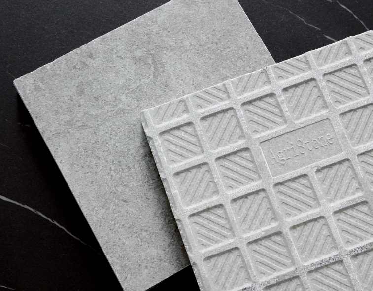
Instead of rows of shrubs or a sweep of turf, imagine a single vertical surface doing the work of an entire front yard. That is the quiet logic behind an accent wall designed to replace traditional landscaping. Built from stacked stone, weathered steel, or deeply textured concrete, it holds the eye the way a garden bed might—but without the constant need for water, mulch, or reshaping. The wall becomes a permanent anchor, borrowing color from the surrounding hardscape and shifting in tone as the light moves across it. In many settings, a well-placed accent wall offers more visual weight than a dozen carefully chosen plants, and it does so while freeing up square footage that would otherwise be lost to maintenance paths or overgrown borders.
The real appeal lies in its ability to frame a home the way hedges once did, but with far fewer demands. A deep charcoal block wall can pull the facade forward, making a modest entry feel deliberate and composed. A warm terracotta render can echo the hues of dry soil or canyon rock, turning what might have been a blank side yard into a distinct outdoor room. Because the wall is vertical, it creates shadow and depth at eye level, where flat ground cover often falls short. You are not eliminating greenery entirely—many designs pair the wall with a single sculptural tree or a low cluster of native grasses—but the wall carries the primary visual burden, so the planting becomes an accent to the architecture rather than the other way around.
There is also a practical honesty to this approach. In climates where water restrictions make lawns impractical, or where slopes make mowing hazardous, a landscape-replacing accent wall solves a problem without announcing itself as a compromise. It does not need irrigation lines, seasonal color rotation, or edging to look intentional. Its texture does the talking: board-formed concrete recalls timber grain, split-face granite catches the afternoon sun, and a simple lime-washed brick reads as both contemporary and old-world. Over time, the wall weathers in place, developing a patina that no freshly laid sod could ever match. It is landscaping reimagined as a single, confident gesture—one that asks nothing from you beyond the willingness to see a wall as something alive.
Stone Veins That Don't Fade in Sun
Some stone patterns lose their contrast the moment they sit under strong daylight, but these veins hold their line. The mineral traces running through the slab stay crisp, so a countertop or wall keeps its depth without turning chalky or washed out over time.
What makes the difference is the way the veining formed. Instead of sitting only on the surface, the color runs through the body of the stone. That means sunlight, heat, and daily cleaning do not blur the edges or drain the tone. You get the same strong veins years later, even in a south-facing room with long hours of exposure.
Matte Finishes for High-Traffic Entries
Entryways see more scuffs, kicks, and dragged bags than almost any other surface in a home. A matte finish hides all that daily wear with surprising ease. Unlike glossy paints that spotlight every scratch under direct light, matte coatings scatter reflections, so minor abrasions and dust marks simply fade into the background. This makes them a practical first choice for mudrooms, hallways, and doors that face constant use.
The appeal is not just visual. High-quality matte formulas today are engineered to handle repeated cleaning without turning shiny or patchy. Many are scrubbable and resist staining from wet shoes or handprints. When you do need to touch up a spot, the lack of sheen means the repair blends in without highlighting a different texture.
For entry spaces, the result is a calm, understated backdrop that still feels intentional. Matte finishes give walls and trim a soft, almost suede-like depth, reducing glare from nearby windows or overhead lights. They also let other elements—like a console table, a statement mirror, or a bold front door—carry the room's personality without competing with shiny surfaces.
Mixing Tile Sizes Without Visual Noise
Mixing tile sizes can quickly turn a floor into a busy patchwork. The trick is to treat one size as the anchor and let the others play a quieter role. If you are combining a large-format field tile with smaller accents, keep the accent pieces to a narrow color range or use them in short runs rather than scattering them everywhere.
Contrast in size works best when texture and finish stay close. A matte 12x24 next to a matte 2x2 mosaic reads as intentional, while mixing high-gloss and rough stone in three different scales tends to compete for attention. Pick one finish family and vary only the dimensions, so the eye notices proportion instead of surface differences.
Grout color also does more than people expect. Choosing a grout close to the dominant tile tone helps the different sizes sit on the same plane, reducing the grid lines that can make a layout feel chopped up. Reserve a contrasting grout for areas where you want the pattern itself to become the focal point.
Warm Neutrals That Shift With the Light
The same greige that feels soft and chalky at noon can turn almost honeyed when the sun drops low. Warm neutrals aren't really one color; they're a conversation between the pigment on the wall and whatever light happens to be in the room. That shifting quality is what gives spaces depth, but it also means small paint chips rarely tell the truth.
In north-facing rooms, these tones often lose their warmth and settle into a cooler, slightly gray cast. In direct afternoon light, the red and yellow undertones wake up and the walls can feel noticeably richer. Watching a large sample at three different times of day matters more than getting the name right.
The trick is to choose a neutral with enough warmth to hold its own in flat morning light but not so much that it turns muddy under warm bulbs. Layered whites, plaster, and aged linen tones tend to shift gently rather than swing between extremes. If a color still feels alive in the corner of a room after dusk, it's probably the one.
FAQ
Porcelain and dense quarry tiles are usually the safest bet because they absorb very little water. If you deal with hard freezes, check for a frost-proof rating and use a flexible adhesive so the wall can expand and contract without tearing tiles loose.
Pick tiles with a matte or lightly textured surface and clean them once or twice a year with warm water and a soft brush. Avoid glossy finishes outdoors, since they show water spots, dust, and small scratches much faster than a natural stone or matte porcelain surface.
Stacked stone panels bring irregular edges and varied shadow lines, which give the wall a more hand-built look. Instead of a uniform grid, you get a slightly rugged surface that changes through the day as light moves across the stone.
They can actually help if the grout color is matched closely to the tile. Fewer grout lines make the wall feel calmer and less chopped up. Just make sure the wall is flat and the installer uses a leveling system, because large tiles can be unforgiving on uneven surfaces.
Lighter earth tones, warm greys, and sand colors tend to be more forgiving because they don't absorb as much heat and they hide fine dust. Very dark charcoal can look dramatic, but it may get uncomfortably hot and show debris more clearly after windy days.
Yes, if you keep the color family tight and treat one texture as the main surface. For example, use a broad area of smooth limestone-look porcelain and add a narrow band of split-face stone as a vertical accent. The contrast reads as intentional rather than random.
Skipping a proper waterproof substrate is a big one. On a balcony or garden wall, moisture can sit behind the tile and weaken the bond over time. Use a cement board or sealed masonry base, slope any horizontal surfaces slightly, and don't let water collect at the bottom edge.
Conclusion
Street-side texture does more than catch attention—it gives a facade a sense of depth that flat paint simply cannot carry. A dry-stack stone panel or ribbed ceramic reads clearly from the curb, and the better options hold their mineral veining without turning chalky after a few summers. For front entries and walkways that see constant use, matte surfaces are the quieter choice: they resist scuff marks, avoid harsh reflected glare, and keep the doorway looking settled rather than showroom-new. The appeal is not in any single detail but in how the surface behaves as light moves across it.
Where a planter bed once demanded watering, weeding, and seasonal replanting, an accent wall in split-face slate or modular stone can anchor the same space with far less upkeep. Mixing tile sizes works best when the color range stays narrow—two or three scales of the same warm greige, for instance, create rhythm without visual clutter. Those warm neutrals shift from sand to clay as the angle of the sun changes, so the exterior feels alive through the afternoon instead of fixed and flat. The result is a front elevation that feels deliberate, durable, and easy to live with.
Contact Us
Contact Person: Emma
Email: [email protected]
Tel/WhatsApp: 8618064423698
Website: https://www.beataceramics.com/